Imagine
you are 3 or 4 feet tall, a meter — give or take 10 cm — and you climb
off this huge yellow bus (the vehicle that teaches you that seat belts
are not important), or you climb out of mom or dad’s car, and — you are
at your school.
Imagine you are 16 or 17, frustrated, tired, angry with the world, and you drive up to your school and walk toward the doors.
Imagine you are 12, and home has its… umm, challenges. And you get off a chaotic school bus and walk toward your school.
What happens next?
Now stop right there.
You
cannot tell me. You don’t know. At the very best you might know the
User Interface you have designed, but in all likelihood you haven’t
really designed anything.
Quick,
what signs are around your school? What does it say on the doors? How
do your entries look from the point of view 3 feet above the ground? Or
with the eyes of a teenager. (Do you have more than one entrance? Are
they equal? Equitable?) What does it sound like? Smell like?
“The hospital entrance
should be as open-plan as possible. Make use of as much natural light,
greenery, water (I’ve worked in a hospital with a small waterfall in the
lobby), and background music.”
 |
| Hospital lobby (top) Detroit DTW Airport (above) |

We
don’t think about this much in education. Even the best of us. In
retail, in hospitality, there are usually people assigned to look at
everything — not just every day, but every hour — to see if the message
is right. Why? Sometimes for sales, to interest an audience in something
we want them interested in. Sometimes for mood, the United tunnel at O’Hare Airport in Chicago is there to relax people.
 |
| Crossing between parts of United’s Chicago-O’Hare Terminal means moving through a work of art |
Piano music in hospital lobbies does the same.
This
is just the very tip of the iceberg. But it’s a big tip. Because that
first impression sets a tone that often extends through every school
day. We try to help — our principals and APs are out front every morning
trying to greet every child, balancing bad architecture and
unintentional user interface design with our humanity. And inside
teachers try to decorate and greet and support, but… how much more
effective we might be if our user interface design was intentional, and
intentionally designed to support children?
What do kids see? What do they feel? What do they smell? What do they hear? What is their experience as they move through your school?
One of the things that is clear is that every
single thing kids see, hear, feel, smell, taste, sends a message about
your school. Every single thing. And many of the messages schools send
are as awful as they are unintentional.
One
of my favorite signs in America is on I-95 in Maryland, just north of
our nation’s capital. “End DUI Enforcement Zone” it reads, and I always
want to say, “time to crack open those beers, boys.” It reminds me of
those ridiculous “Drug Free School Zone” signs. As kids at at least one
Michigan school wrote on the back of one of those signs, “Now Leaving
Drug Free School Zone.”
Which
explains why I asked an elementary school principal to take down a sign
over the front door that read, “Enter to Learn.” “Should the other side
say, “Leaving School, Stop Learning”?” I almost asked.
“We used to have this ‘no hats’ rule,” says one of our high school principals. “We had it for good reasons, trying to limit certain negative cultural symbols, but, every morning we greeted our children by telling them to take their hats off. It was awful. So now we allow hats, and when the kids arrive we get to just say hello to them.”
So, in no particular order, ten look fors to define the user experience in a positive way.
One — Clean up your entries. Get rid of signs with the word “No.”
That’s just a bad start word. If you must (and we must), organize a row
of international symbols for no smoking, no alcohol, no guns. Repeat as
necessary. And instead make sure there are positives. Not cheerleading
necessarily, how about questions to ponder? A @Wonderopolis wonder of
the day? Videos playing of interesting stuff? How will you welcome kids
and sell the cool learning inside?
Two
— Have many fewer rules, and ONLY have rules you can successfully defend
in a debate with a student. Why can’t kids chew gum? Kids chew gum in
all our schools, teachers chew gum in all our schools. The issue with
gum is — I am usually told — with its disposal (under chairs, desks, on
the floor). So the rule should be about how we throw things away. Kids
can understand that rule. Kids can’t understand rules about — not eating
or drinking in class or around computers. They can’t understand rules
about — hello elementary schools
— staying in straight lines and don’t touch the walls while in the
corridor. They can’t understand bans on cell phones or hats or lots of
kinds of clothing. They can’t understand why a they need a pass in the
halls or why, on occasion, they can’t just skip a class and go to the
library. Why can’t they understand these things? Because they watch the
world and they know what adults do.
Three
— Turn off your bells. Turn off your PA. Schools do not need bells.
We’ve all got our phones, there are clocks everywhere. We know what time
it is. The factory whistle can go away now. That’s part A. Part B is
stop interrupting your kids. It takes kids over 5 minutes to really get back to work after a 30 second announcement.
And it’s 2016 people, in elementary schools email the teachers. In
secondary put it on Twitter. Or send a note to the effected classroom.
Four
— Eliminate lunch detention and no recess punishments. Those are cruel
punishments which demolish your credibility with every child.
Five
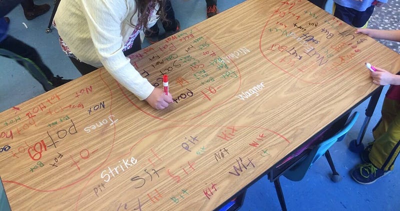
— Working graffiti is good. When kids see other kids’ work they get
inspired. Which makes the dry erase marker your best friend. Our kids
write everywhere. On floors, on Windows, on desks and tabletops, of
course on whiteboards. It not only leverages the power of large muscle
movement and lets thinking quickly take shape, it gets other kids
interested.
Six
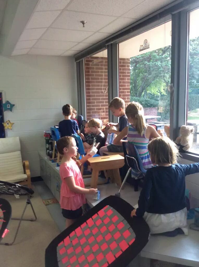
— Make sure that no teacher desk blocks student access to a window.
Unfortunately we’ve all seen it, teachers who grab the best corner of
the room and set up house for themselves. And few things send a stronger
message that the room is not the kids’ domain. Natural daylight is
essential for kids, and so those windows belong to them. Obvious corollary: clean off all of those window sills. That’s kid space.
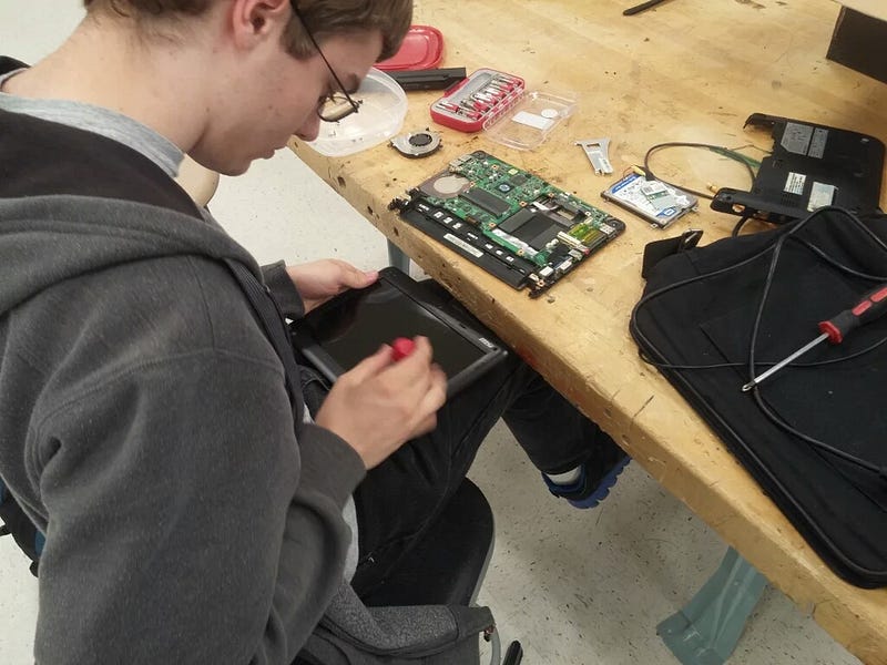
Seven — Always allow passion time. In every day, in every half day, let kids chase what matters to them. Children, and everyone in K-12 is a child, need space to explore their world, which is not necessarily your world.
Eight
— Skip the homework. Haven’t you taken up enough of their day? Let them
have time to be children in a real way. So why not send them off at the
end of the school day with things to wonder about, or maybe to find
someone to share their discoveries with, or with hopes that they might
imagine a story to share tomorrow?
Nine — Stop ranking children.
Throw out your age-based grade levels, your numerical or letter
grading, your honor rolls, your “how many books did you read?” Stop
separating kids by reading level. Kids in this world have enough to
worry about without our arbitrary ratings. And remember, when adults rank kids, bullying begins.
Ten — If
it’s glass, it’s supposed to be transparent. Stop covering windows,
windows to the outside, windows to the corridors, windows into rooms,
windows in doors. What are you hiding in there? What are you doing that is bad for kids to see?
School is no place to keep the learning and creations of other kids a
secret. It is no place for the adults to be plotting against children
behind drawn shades. It is no place for keeping the outside world out.
Understand, every covered window says you are hiding something in a
place that’s supposed to be about openness and discovery.
Everything
we do tells our users — our children — something. What is your school,
from every inch of the building to every word we say, saying? What is it
that our kids are experiencing?
Ask yourself this, every time you walk into your school, every time you speak, or do, or plan.
- Ira Socol
No comments:
Post a Comment