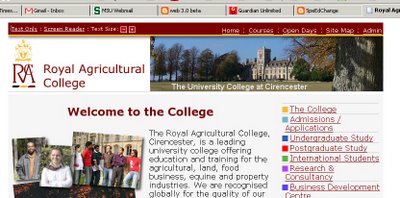
 Every page on the RAC site is topped by an accessibility bar that allows every web visitor to choose between the graphical version, a plain-text version, or a version designed specifically for screen readers. There are also quick buttons to change the type size.
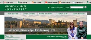
Compare this to the typical educational site (allow me to use my own Michigan State University
 as an example). MSU's site does contain an accessibility statement, but it is in the very last line of the page - a screen reader user would have to allow a default reading of the entire page in order to come to this item. RAC does it correctly, with the choice in the upper left-hand corner where even a fully blind-browser or screen reading system (such as JAWS) would find it instantly.
 The automatic creation of accessibility choices - without any need for any training or discovery time - is what makes this a perfect solution. The first time that I saw it, after communicating with one of the professors there about accessibility issues,
  I realized "this should be the model."
The challenge is to look at your school or university's web site. How easy is it to get to the accessibility options? How easy is it to make the type bigger? Could you operate your site with a screen reader and the monitor turned off?
Remember. This isn't just about students - schools often say, "we don't have any blind students." But what about parents? guardians? relatives? prospective students? or even the citizens
 who fund your school or grant it tax-free status? Someone in your school community needs these accommodations. And if they need the accommodations, they need to be able to find those accommodations without first taking a course in navigating your website.
For web access advice and tutorials you may want to start at WebAim and WC3, the Web Accessibility Initiative. To test sites, use CynthiaSays... and open your digital doors to everyone.
- Ira Socol
I've found that web sites that put the accessibility stuff at the top are often also better thought out in more ways than just that.
ReplyDeleteI also wanted to point out that many CMS come with accessibility built in. Plone comes to mind.
--htb